The claim was true. It was also the claim everyone else was making.
Every company selling into that market was already promising better for the environment, and most of them could not back it up. A large manufacturer who has heard it a hundred times discounts it on sight, and the ones with real engineering behind the claim get discounted with the rest.
Schropp is in Germany and the engineering was real: biodegradable single use packaging, including a see through paper that lets a bakery show what it is selling without wrapping it in plastic.
It sold across several distinct product categories with no brand holding them together, and nothing that told a manufacturer why this was different from the last ten pitches.
If the words are the category’s words, the product goes in the category’s bucket.
The first decision was to give up the category’s own vocabulary. Not the argument, the vocabulary: the phrases, the imagery and the tone every competitor was using, because borrowing them files a substantiated product with the empty ones. What went in instead was the language of engineering, and nothing was said that could not be shown.
That took the real work, which was deciding what to actually say about the material and then rephrasing it until the specifics landed rather than the promise. I led the process and the creative direction, working with my graphic designer.
The second decision was where that message would live. The categories did not each need an identity. One identity held all of them, with colour and imagery doing the separating, so a category could be added without the brand being rebuilt around it.
They were an established operation before this. Afterwards they read like one.
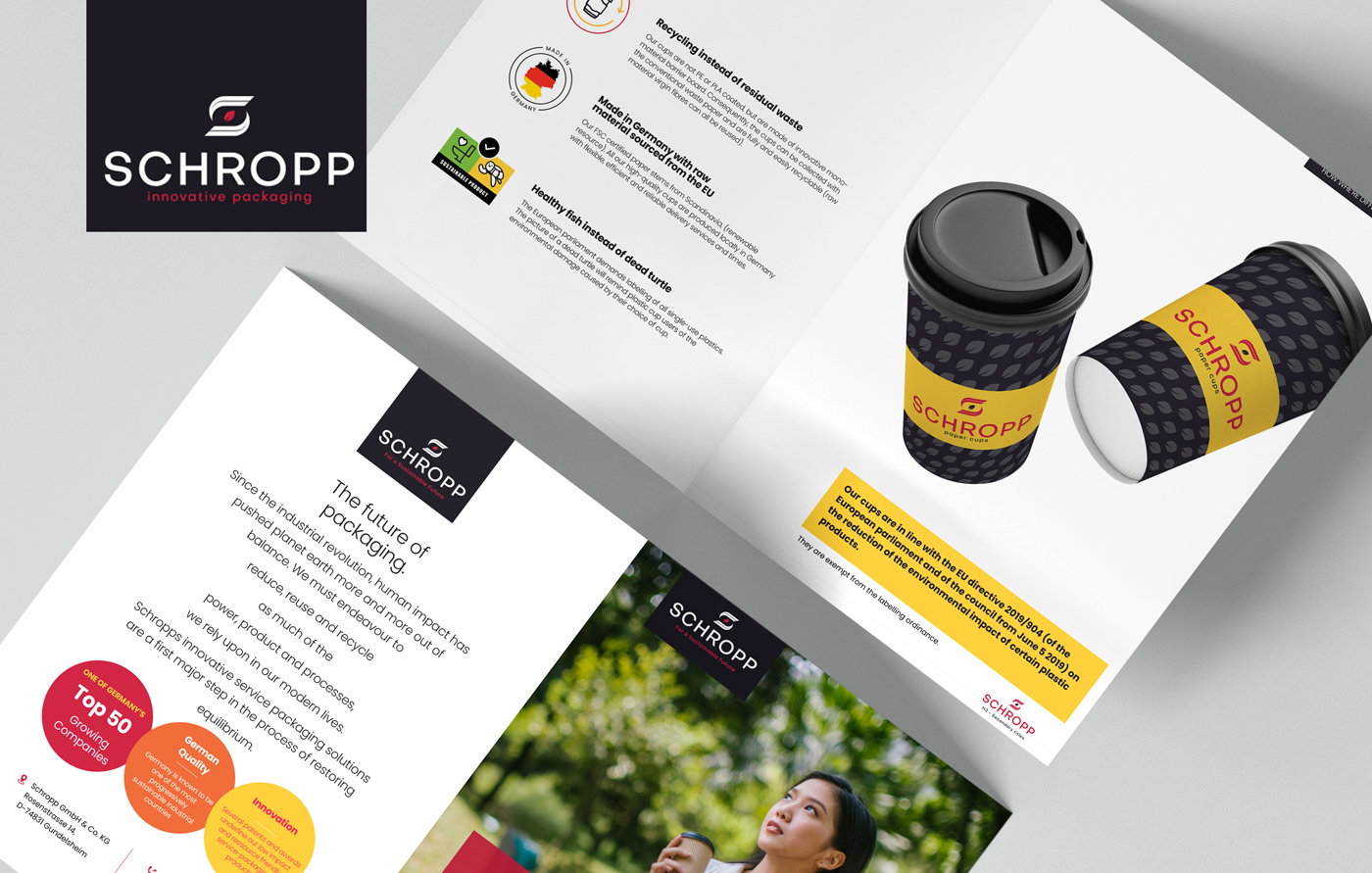
The brochure and the website carried the message into every category, and both were built to make the case to a manufacturer without a Schropp person beside him making it.
That is what the work was built to do, and it is where the honest account of this one stops. The engagement ended at delivery and no measured result exists for it. The only person who can say whether it worked is the client.
“We had the product. We didn’t have the words for it. Zoltán gave us a value proposition we could launch with, and it’s still what we lead with.”
Sven Schropp, CEO, Schropp GmbH & Co.
The same decision had to survive being printed, and being a website.
After the message came the identity: the logo, the type and colour, and the rules for how a category takes a colour of its own without leaving the system. Then the brochure. Then the site.
It is one engagement and it ran from what to say to what a manufacturer ends up holding. Nothing was handed over halfway for somebody else to interpret, which is where an argument usually thins out.
I directed it, with my graphic designer working next to me.
The brochure, and the product it argues for
The identity applied outdoors
Powered Storage
One yard, and a separate business for each kind of tenant in it.